Result

Challenge
I treated the challenge as a brand problem before a production problem. There was no existing case study asset system to lean on, so the first task was defining the visual standard: what “premium” means in motion for Baast, and which key moments should become representative images.
Then came execution reality. The installation was difficult to capture cleanly — reflections, layered surfaces, and interaction that can quickly feel instructional. With a lean setup (solo production, three visits), the work depended on curation and pre-planning more than equipment: selecting the right hero moments upfront so the final edit could feel calm, tactile, and premium.
Approach
I designed the film around three hero moments so the story would have intentional peaks:
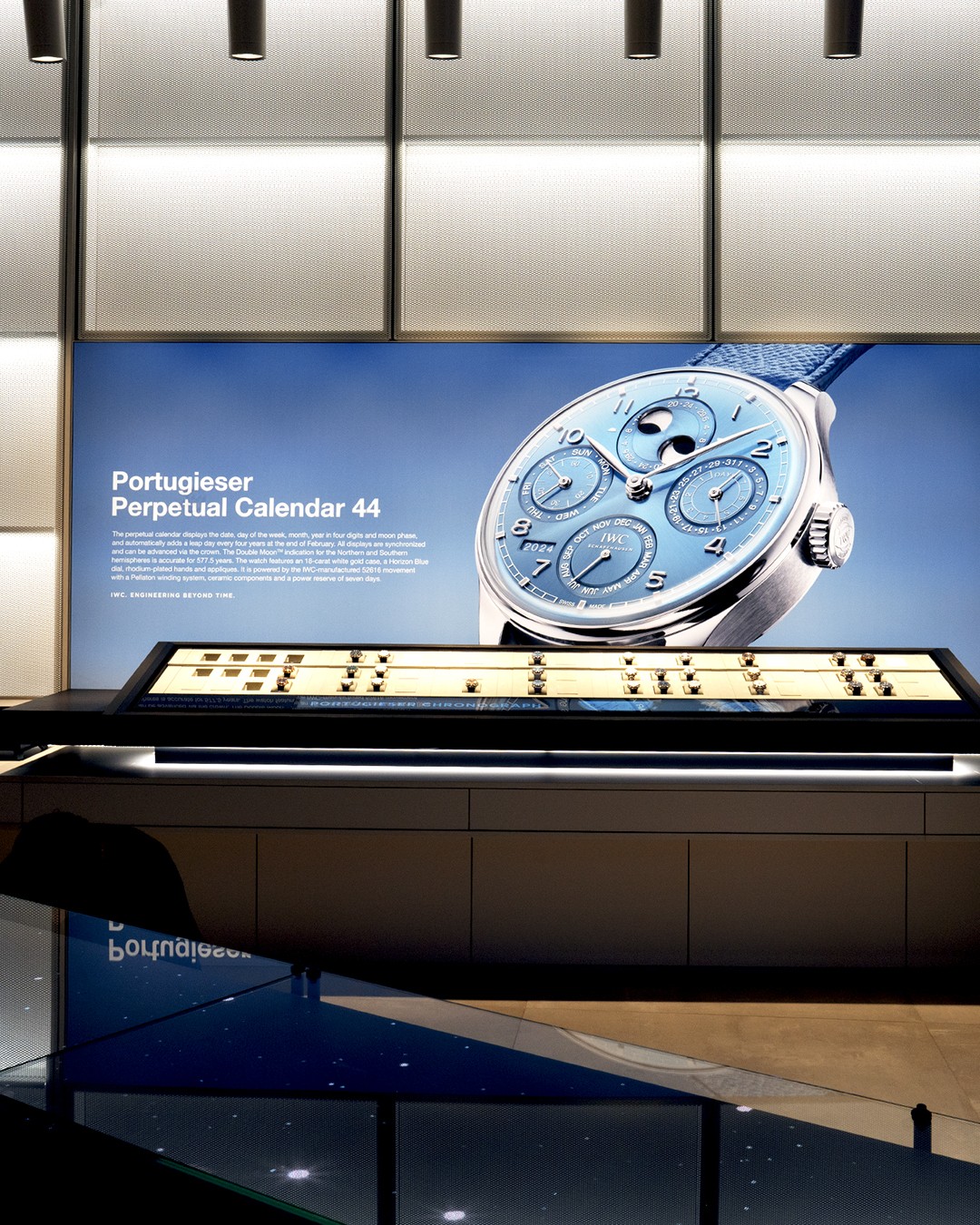
1. Atmosphere — establishing the boutique context and the table as an object of presence
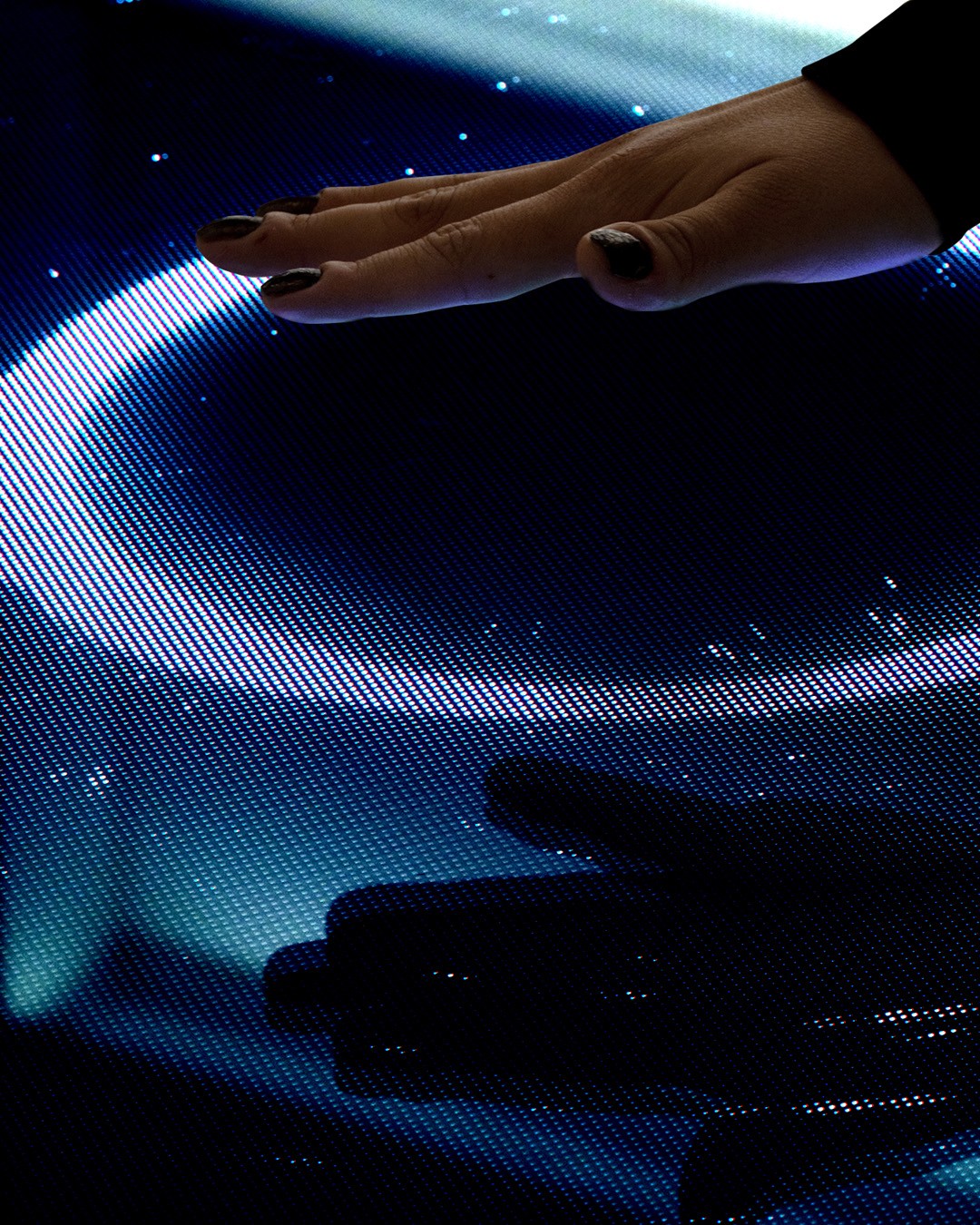
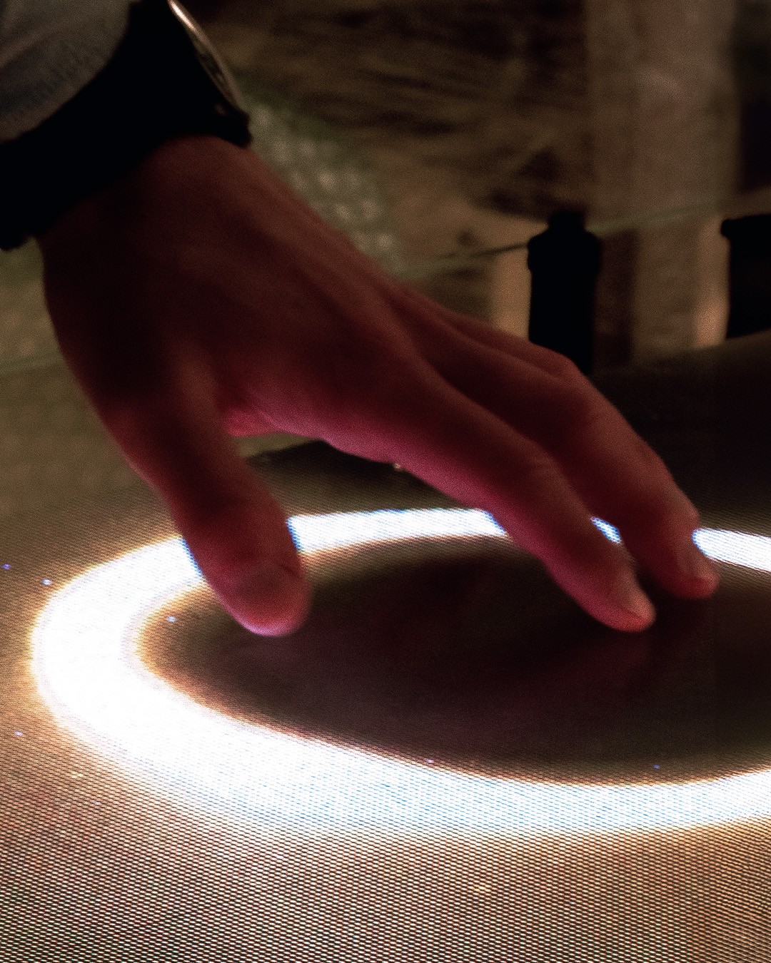
2. Interaction — gesture-led sequences that show responsiveness without explanation
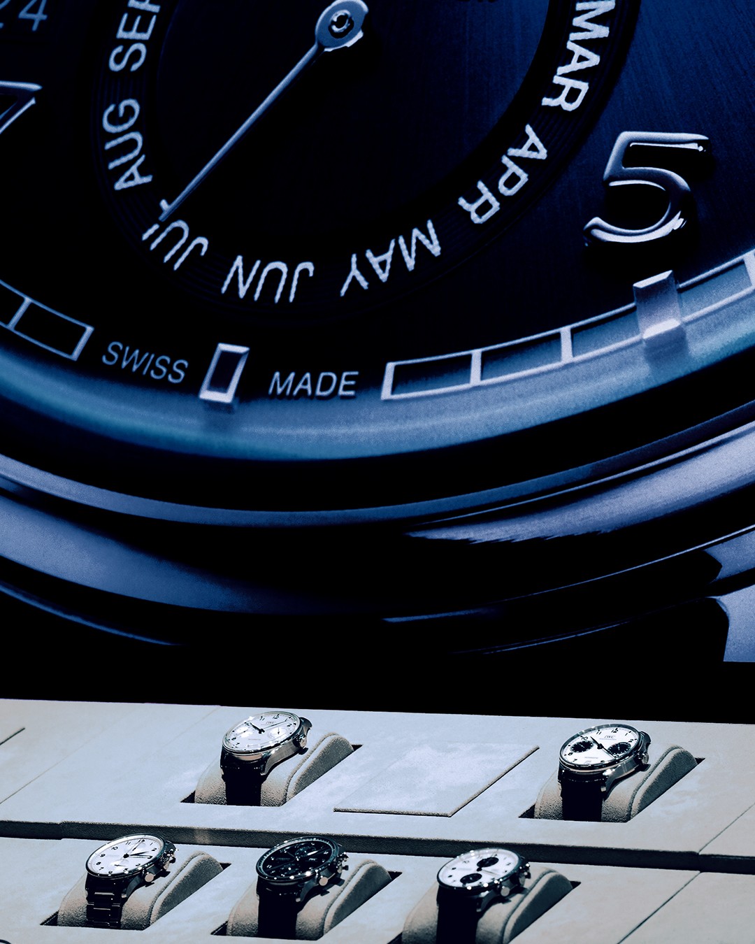
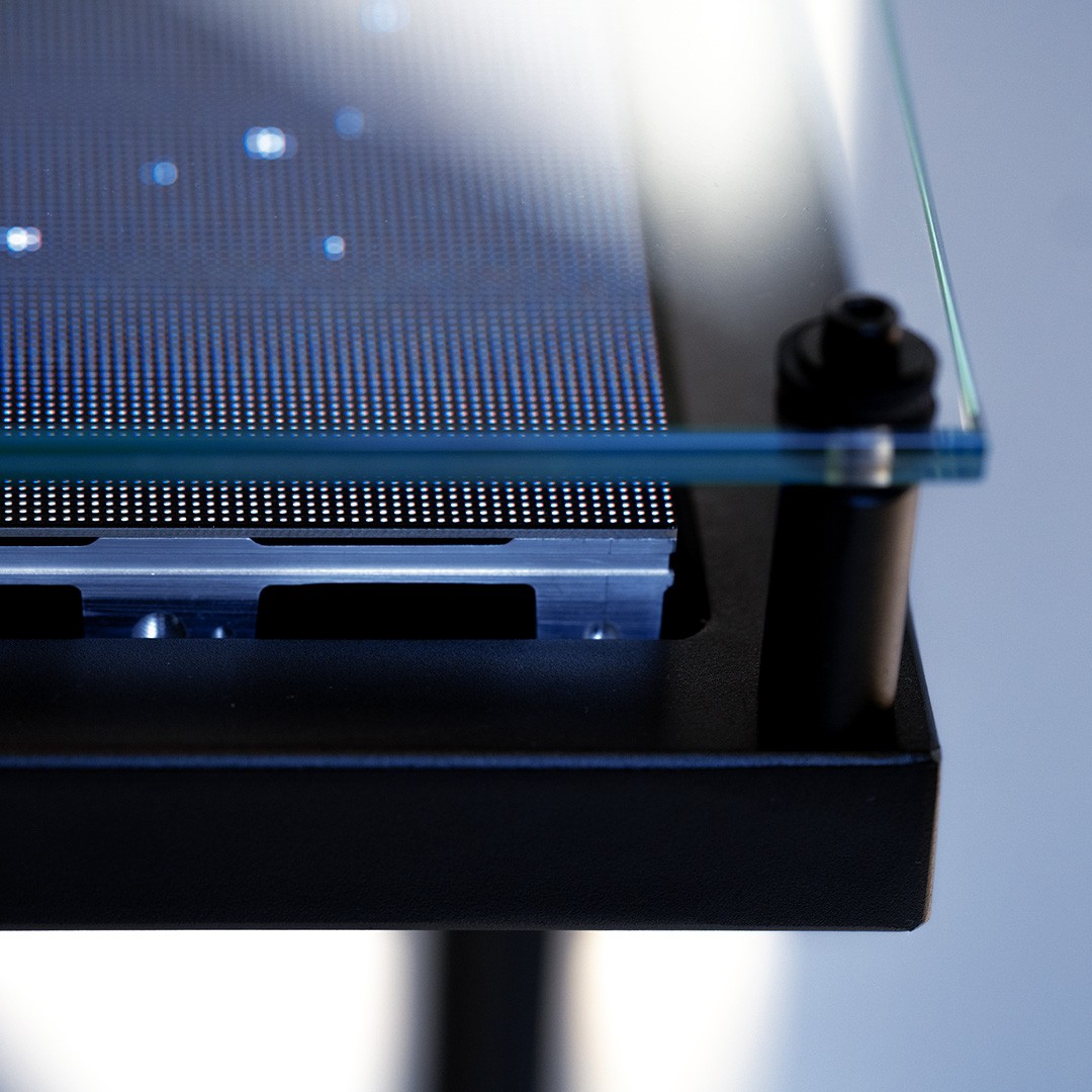
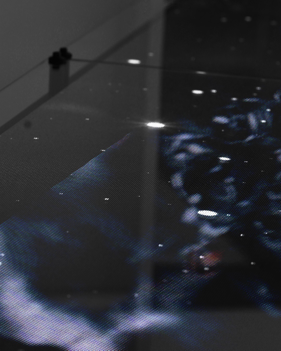
3. Universe — close framing that implies craft, material quality, and the universe theme
On site, I focused on reducing reflection noise and directing attention toward what communicates value: hand movement, surface response, and the moment the table reveals its scale. I also directed the model’s performance. I coached a gentle gesture language and aligning timing, posture, and angle with the artwork’s motion so the interaction felt choreographed rather than acted.


Production
Production stayed intentionally lean: Sony A7 series camera, two lenses (detail zoom + wider landscape), stabilizer, and a portable LED light , which was enough to control the image clean while staying composed during the open hour at IWC retail shop.
Edit
I structured the sequence from scale to detail: starting with the full boutique and the table in context, moving into interaction highlights, and closing on smaller, abstract snapshots that leave an emotional afterimage. The goal was to let the viewer first understand presence and scale, then experience tactile interaction, and finally end with a lingering impression rather than a technical explanation.
That abstract ending is intentional: abstract imagery tends to invite more subjective interpretation from viewers, because it leaves space for projection and personal meaning rather than prescribing one fixed reading.
Grade
The color decision was to preserve the original colour truth of the installation while making the tone feel deeper, cleaner, and more dense without pushing the palette into something artificial. The grade adds depth through controlled contrast, tighter whites, rich in color, so the visuals feel more considered while staying faithful to the space.
Pre-grade / Post-grade — preserved colour truth, added depth and restraint for a premium tone.

Reflection
Premium is built through control: light discipline, clean framing, restrained movement, and pacing that gives materials time to feel valuable. Planning 2–3 hero moments upfront creates designed peaks — not accidental highlights. I learned that shooting more isn’t the same as showing better; selecting fewer, stronger moments reads more premium. I also learned that direction is subtraction: choosing what not to show protects mystery and elevates perception. Finally, handling camera, lighting, edit, and grade solo clarified how directly craft decisions shape brand credibility — especially in motion.