Baast's first campaign identity, from a single message to a cohesive system across website and social.

Type

Brand Campaign Web Design

Credit

Creative Director

Roel Kok

Abril Alvarez

Roel Kok

Abril Alvarez

Business Development Lead

Monica Liu

Monica Liu

Work scope

Art Direction, Concept Development, Contents Creation, Photography, Videography, Motion design, Web design

Year

2025

Building on the Prism campaign direction, I designed a dedicated service page for Baast’s R&D prototyping offer. This was the first time the service had its own clear place on the website. The main challenge was finding the right balance. The page needed to feel trustworthy and tech-driven for the right audience, while still making clear that Baast works in early-stage ideas, testing, and prototyping, not finished product delivery. To solve that, I reused around 80% of the existing CMS UI components and introduced a smaller set of new elements to bring out the R&D focus more clearly. This kept the page on brand, reduced development complexity, and made the experience familiar for users. I also directed the hero film and created supporting content to help explain the offer more clearly. The page structure was designed to guide people from understanding the service to booking a call, giving the campaign a more focused and useful destination than it had before.

Role

My role covered page design, information structure, and content creation. I also created the hero film from research to production, helping shape both how the service was explained and how it first came across.

Problem

The service did not yet have its own clear place on the website. The page needed to feel trustworthy and tech-driven for the right audience, while still showing that Baast works in early-stage ideas, testing, and prototyping, not finished product delivery. It also had to work within the existing website system, so the build stayed efficient and the experience stayed familiar.

Goal

The goal was to make the offer easier to understand and easier to act on. To do that, I reused most of the existing CMS UI and added only what was needed to make the R&D focus clearer without breaking the brand system. The page structure was built to guide people from understanding the service to booking a call.

Outcome

80/20%

80/20%

80% existing CMS components reused, 20% new design introduced — balancing speed, brand coherence, and the nuanced R&D tonal positioning.

End-to-End in 1 Week

From strategy and content creation to UI design and dev handoff. A full service presence built from scratch, giving the Prism campaign a structured, conversion-ready destination for the first time.

Sales-Ready page

The page gave Baast's sales team a direct tool to share with ICP decision-makers, supporting outreach and call booking beyond the campaign itself.

PROJECT SCOPE

Contents Creation

2.5 days

Developing hero and supporting content using existing assets. Creating a selection logic using a positioning scale (abstract/experimental ↔ conservative/finished) to curate projects that are creative but clear, and credible/shipped. Archiving process materials, classifying projects, then edit the set into an 15sec second hero sequence through multiple edit iterations to maximize attention + message clarity.

*

Content Selection Criteria plan

Hero Storyboard + Sequence Plan

Hero video Edit

Discovery

1 days

Collaborated with the sales strategist and manager to clarify what the R&D page must communicate—its innovation-lab identity, key messages, and target audience—while aligning with the internal developer on CMS constraints and what could or couldn’t change. Reviewed the existing design system to define what could be reused versus what needed differentiation.

*

Team alighnment ( sales / Marketing / design / Dev)

CMS & Component Audit

Reference Review

Website Design

3.5 days

Designing the R&D page as a system extension: keeping core CMS components for cohesion and dev efficiency, while differentiating through primary color system (black), results-forward layout, and modular structure (slide albums + standardized process blocks). Defining layout rules and page flow for readability and engagement.

*

Layout System Rules

Information Architecture

Module Design

Outcome

End-to-End in 1 Week

From strategy and content creation to UI design and dev handoff. A full service presence built from scratch, giving the Prism campaign a structured, conversion-ready destination for the first time.

Sales-Ready page

The page gave Baast's sales team a direct tool to share with ICP decision-makers, supporting outreach and call booking beyond the campaign itself.

80/20%

80% existing CMS components reused, 20% new design introduced — balancing speed, brand coherence, and the nuanced R&D tonal positioning.

PROJECT SCOPE

Discovery

1 days

Collaborated with the sales strategist and manager to clarify what the R&D page must communicate—its innovation-lab identity, key messages, and target audience—while aligning with the internal developer on CMS constraints and what could or couldn’t change. Reviewed the existing design system to define what could be reused versus what needed differentiation.

*

Team alighnment ( sales / Marketing / design / Dev)

CMS & Component Audit

Reference Review

Website Design

3.5 days

Designing the R&D page as a system extension: keeping core CMS components for cohesion and dev efficiency, while differentiating through primary color system (black), results-forward layout, and modular structure (slide albums + standardized process blocks). Defining layout rules and page flow for readability and engagement.

*

Layout System Rules

Information Architecture

Module Design

Contents Creation

2.5 days

Developing hero and supporting content using existing assets. Creating a selection logic using a positioning scale (abstract/experimental ↔ conservative/finished) to curate projects that are creative but clear, and credible/shipped. Archiving process materials, classifying projects, then edit the set into an 15sec second hero sequence through multiple edit iterations to maximize attention + message clarity.

*

Content Selection Criteria plan

Hero Storyboard + Sequence Plan

Hero video Edit

Discovery

Website Design

Contents Creation

  1. Design Approach

1.01 Site Positioning Research

Before designing website, I aligned with the sales strategist and manager on what the R&D page must communicate: BAAST is not only delivering finished products — it is also an innovation lab but it should not lean to abstract / experimental mood. To avoid hero content that felt either too abstract and techy art work or too conservative/finished-focus product, I started to find a positioning spot for Baast's R&D site direction by researching competitor's similar service/campaign cases.

1.02 Designing within Constraints

The page had to live inside an existing CMS and website ecosystem, so I treated the current structure and existing CMS components as the base system for the wireframing stage. This approach preserved development efficiency and cross-site consistency in terms of user familiarity. For the final version, of the 16 modules considered, 7 were selected — 6 reused directly from the existing CMS and 1 newly designed — keeping development complexity low while delivering a focused, conversion-ready layout. The remaining 9 were dropped due to scope, timeline, or tone fit.

*Module names are my own working labels for wireframing reference, not the official CMS terminology.

UI Module inventory list

Module

Status

Final Selection

Reason

Hero

Existing CMS

Dropped

Replaced by Video Hero for stronger tonal impact

Video Hero

Existing CMS

Used

Sets credible, tech-driven tone without feeling experimental

Page Header

Existing CMS

Used

Clear page entry point, coherent with existing site system

Used

Card Grid

New design need

Dropped

Out of scope — content structure didn't require grid format

Dropped

List UI

Existing CMS

Used

Out of scope — replaced by more visual components

Used

Two Column

Existing CMS

Used

Efficient layout for presenting offer

Used

Slider / Carousel

Existing CMS

Used

Supports content browsing without adding page length

Used

Feature Block

New design need

Dropped

Dev complexity. out of scope for 1 week timeline

Dropped

Timeline

New design need

Dropped

Tone mismatch. felt too process-heavy for R&D positioning

Dropped

Album Grid

Existing CMS

Dropped

Replaced by Carousel for better flow and dev efficiency

Dropped

Motion UI

New design need

Used

Adds tech-driven feel without feeling experimental

Used

CTA Section

Existing CMS

Used

Core conversion goal — guides ICP to book a call

Used

Form

New design need

Dropped

Dev complexity — CTA section handled conversion instead

Dropped

Testimonial

New design need

Dropped

Out of scope — no client quotes available at this stage

Dropped

Key Metrics

New design need

Dropped

Out of scope — no performance data available yet

Dropped

UI Module inventory list

Module

Status

Final Selection

Reason

Hero

Existing CMS

Dropped

Replaced by Video Hero for stronger tonal impact

Video Hero

Existing CMS

Used

Sets credible, tech-driven tone without feeling experimental

Page Header

Existing CMS

Used

Clear page entry point, coherent with existing site system

Card Grid

New design need

Dropped

Out of scope — content structure didn't require grid format

List UI

Existing CMS

Used

Out of scope — replaced by more visual components

Two Column

Existing CMS

Used

Efficient layout for presenting offer

Slider / Carousel

Existing CMS

Used

Supports content browsing without adding page length

Feature Block

New design need

Dropped

Dev complexity. out of scope for 1 week timeline

Timeline

New design need

Dropped

Tone mismatch. felt too process-heavy for R&D positioning

Album Grid

Existing CMS

Dropped

Replaced by Carousel for better flow and dev efficiency

Motion UI

New design need

Used

Adds tech-driven feel without feeling experimental

CTA Section

Existing CMS

Used

Core conversion goal — guides ICP to book a call

Form

New design need

Dropped

Dev complexity — CTA section handled conversion instead

Testimonial

New design need

Dropped

Out of scope — no client quotes available at this stage

Key Metrics

New design need

Dropped

Out of scope — no performance data available yet

1.03 Wireframing

Starting from the CMS module inventory, two wireframe directions were explored. Iteration 1 was simpler and visual-led with a shorter page length. Iteration 2 was more informative, adding a timeline, key metrics, testimonials, and a booking calendar. After reviewing both with a developer and manager, iteration 1 was selected — the added modules in iteration 2 were impractical within the CMS constraints and one-week timeline. The right page was not the most informative one, but the one that communicated clearly and delivered efficiently before the deadline.

Iteration 1

Iteration 2

1.01 Site Positioning Research

Before designing website, I aligned with the sales strategist and manager on what the R&D page must communicate: BAAST is not only delivering finished products — it is also an innovation lab but it should not lean to abstract / experimental mood. To avoid hero content that felt either too abstract and techy art work or too conservative/finished-focus product, I started to find a positioning spot for Baast's R&D site direction by researching competitor's similar service/campaign cases.

  1. Design Direction

2.01 Color

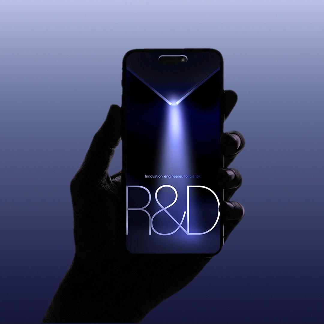
One of the challenge was to make the R&D sit under same umbrella branding system, but also design it as a distinctive service branch. I had to be same System, but different personality. I chose different primary color strategy to the other pages. In color system, case study pages used a white background. The R&D page switched to a black background to express a more experimental, lab-like identity. This created immediate contrast while staying within the same component framework.

Baast Case study page (white background)

Baast R&D page (Black background)

2.02 Layout and Flow

The page flow was shaped by the brief with one focal point: move the ICP from understanding to action with minimal friction. Every layout decision was made to serve that sequence: positioning, proof, process, trust, then CTA. The task as a designer is to interpret the brief into visual form and layout the best.

Hero section

Debrief

The hero needed to land one clear message instantly such as "this is a tech-driven, deliverable-focused innovation lab, not an abstract concept studio."

Outcome

A video hero that signals R&D immediately through lead visual and first-screen composition, paired with focused hero copy.

Results / Approach Section

Debrief

Benefit-driven copy earns attention before the user commits to reading deeper. Placing outcome blocks directly after the hero keeps the momentum from the first impression and reduces early drop-off.

Outcome

Four numbered approach blocks surfaced directly below the hero, each targeting a specific ICP pain point in the numbered list.

Slider section

Debrief

Claims need immediate visual proof or the ICP disengages. The carousel was chosen over a gallery style. Gallery adds too much scroll weight and competes with the hero, while carousel delivers diverse visuals in a single contained view. Assets were curated from existing Baast work, filtered by two criteria: tonal fit with the R&D positioning and visual diversity to show range without feeling scattered.

Outcome

A compact video carousel placed directly after the approach section, delivering instant visual proof of capability while maintaining scrolling momentum.

Team section

Debrief

The copy emphasises security, compliance, and operational constraints. The visuals needed to answer one implied question from the ICP: "Can they actually deliver with us?"

Outcome

I photographed and edited the team images myself, directing a clean neutral tone with a small neon monitor accent as the only colour point. Two photos were selected to show two distinct engineering aspects — hands-on physical work and digital code work — within the same consistent visual direction. A two column photo layout that reads as focused, reliable and technically grounded.

CTA section

Debrief

This section shifts tone from proof to engagement. The visual needed to signal communication and partnership rather than capability, supporting the call booking intent.

Outcome

A full conference talk photo that signals presence, confidence and professional credibility at scale, paired with the "Book a Discovery Call" CTA, closing the page on a note of demonstrated authority and genuine collaboration.

Hero section

Debrief

The hero needed to land one clear message instantly such as "this is a tech-driven, deliverable-focused innovation lab, not an abstract concept studio."

A video hero that signals R&D immediately through lead visual and first-screen composition, paired with focused hero copy.

Outcome

Slider section

Debrief

Claims need immediate visual proof or the ICP disengages. The carousel was chosen over a gallery style. Gallery adds too much scroll weight and competes with the hero, while carousel delivers diverse visuals in a single contained view. Assets were curated from existing Baast work, filtered by two criteria: tonal fit with the R&D positioning and visual diversity to show range without feeling scattered.

A compact video carousel placed directly after the approach section, delivering instant visual proof of capability while maintaining scrolling momentum.

Outcome

Results / Approach Section

Debrief

Benefit-driven copy earns attention before the user commits to reading deeper. Placing outcome blocks directly after the hero keeps the momentum from the first impression and reduces early drop-off.

Four numbered approach blocks surfaced directly below the hero, each targeting a specific ICP pain point in the numbered list.

Outcome

Team section

Debrief

The copy emphasises security, compliance, and operational constraints. The visuals needed to answer one implied question from the ICP: "Can they actually deliver with us?"

I photographed and edited the team images myself, directing a clean neutral tone with a small neon monitor accent as the only colour point. Two photos were selected to show two distinct engineering aspects — hands-on physical work and digital code work — within the same consistent visual direction. A two column photo layout that reads as focused, reliable and technically grounded.

Outcome

CTA section

Debrief

The hero needed to land one clear message instantly such as "this is a tech-driven, deliverable-focused innovation lab, not an abstract concept studio."

A video hero that signals R&D immediately through lead visual and first-screen composition, paired with focused hero copy.

Outcome

3. contents creation

3.01 Contents Positioning Map

Before designing any content, I created a 2x2 positioning map to audit Baast's existing work against two axes — Maturity and Distinction. Maturity measures how proven a piece of work is, from early concept to shipped product. Distinction measures how differentiated it is from the broader tech market. The Hero zone sits where both are high.

Each dot represents a piece of existing Baast work — the more vibrant the orange, the stronger its positioning. The audit revealed most existing work clustered toward Generic or Unclear. Only a focused selection reached the Strong quadrant, and those became the content foundation for the page.

  1. Reflection

While working on the Prism case-study page, I kept noticing that strong visuals alone were not enough to carry the story. The harder part was deciding what people needed to understand first, and what could wait.

I learned to treat the layout less like a gallery and more like a reading sequence. The opening had to frame the project quickly. The next sections had to earn attention by showing outcome and direction before asking for more reading.

That process taught me that website design is not only about expression. It is also about controlling clarity. A good page does not just look structured. It helps the viewer understand the work with less effort.

Type

Brand Campaign Web Design

Year

2025

Credit

Creative Director

Roel Kok

Abril Alvarez

Business Development Lead

Monica Liu

Work scope

Art Direction, Concept Development, Contents Creation, Photography, Videography, Motion design, Web design

PROJECT SCOPE

Contents Creation

2.5 days

Developing hero and supporting content using existing assets. Creating a selection logic using a positioning scale (abstract/experimental ↔ conservative/finished) to curate projects that are creative but clear, and credible/shipped. Archiving process materials, classifying projects, then edit the set into an 15sec second hero sequence through multiple edit iterations to maximize attention + message clarity.

*

Content Selection Criteria plan

Hero Storyboard + Sequence Plan

Hero video Edit

Discovery

1 days

Collaborated with the sales strategist and manager to clarify what the R&D page must communicate—its innovation-lab identity, key messages, and target audience—while aligning with the internal developer on CMS constraints and what could or couldn’t change. Reviewed the existing design system to define what could be reused versus what needed differentiation.

*

Team alighnment ( sales / Marketing / design / Dev)

CMS & Component Audit

Reference Review

Website Design

3.5 days

Designing the R&D page as a system extension: keeping core CMS components for cohesion and dev efficiency, while differentiating through primary color system (black), results-forward layout, and modular structure (slide albums + standardized process blocks). Defining layout rules and page flow for readability and engagement.

*

Layout System Rules

Information Architecture

Module Design

Building on the Prism campaign direction, I designed a dedicated service web page for Baast's R&D prototyping offer. This was where the first time this R&D prototyping service had its own structured web presence. The core design challenge was tonal: the page needed to sit in a precise middle ground, credible and tech-driven enough for ICP, but not so polished it read as a finished product studio. To reduce development complexity and minimise new learning curves for users, I reused 80% of existing CMS UI components while introducing 20% new design elements to carry the nuanced R&D positioning keeping on-brand UI asset. I also directed the hero film and created on-demand content to support the narrative. The information structure was built to guide ICPs from understanding the offer to booking a call, giving the campaign a focused, conversion-ready destination it previously lacked.

Studio Baast Campaign Identity Design

Luxury art technology brand, Baast Contents creation

Studio Baast Campaign Identity Design

Luxury art technology brand, Baast Contents creation

Designer specializing in branding, web, and motion. Been designing since noticing things nobody else cared about. Grew up. The obsession didn't. Now turning that into experiences people love.

© 2026 All rights reserved.

Designer specializing in branding, web, and motion. Been designing since noticing things nobody else cared about. Grew up. The obsession didn't. Now turning that into experiences people love.

© 2026 All rights reserved.

Designer specializing in branding, web, and motion. Been designing since noticing things nobody else cared about. Grew up. The obsession didn't. Now turning that into experiences people love.

© 2026 All rights reserved.

Designer specializing in branding, web, and motion. Been designing since noticing things nobody else cared about. Grew up. The obsession didn't. Now turning that into experiences people love.

© 2026 All rights reserved.