Outcome
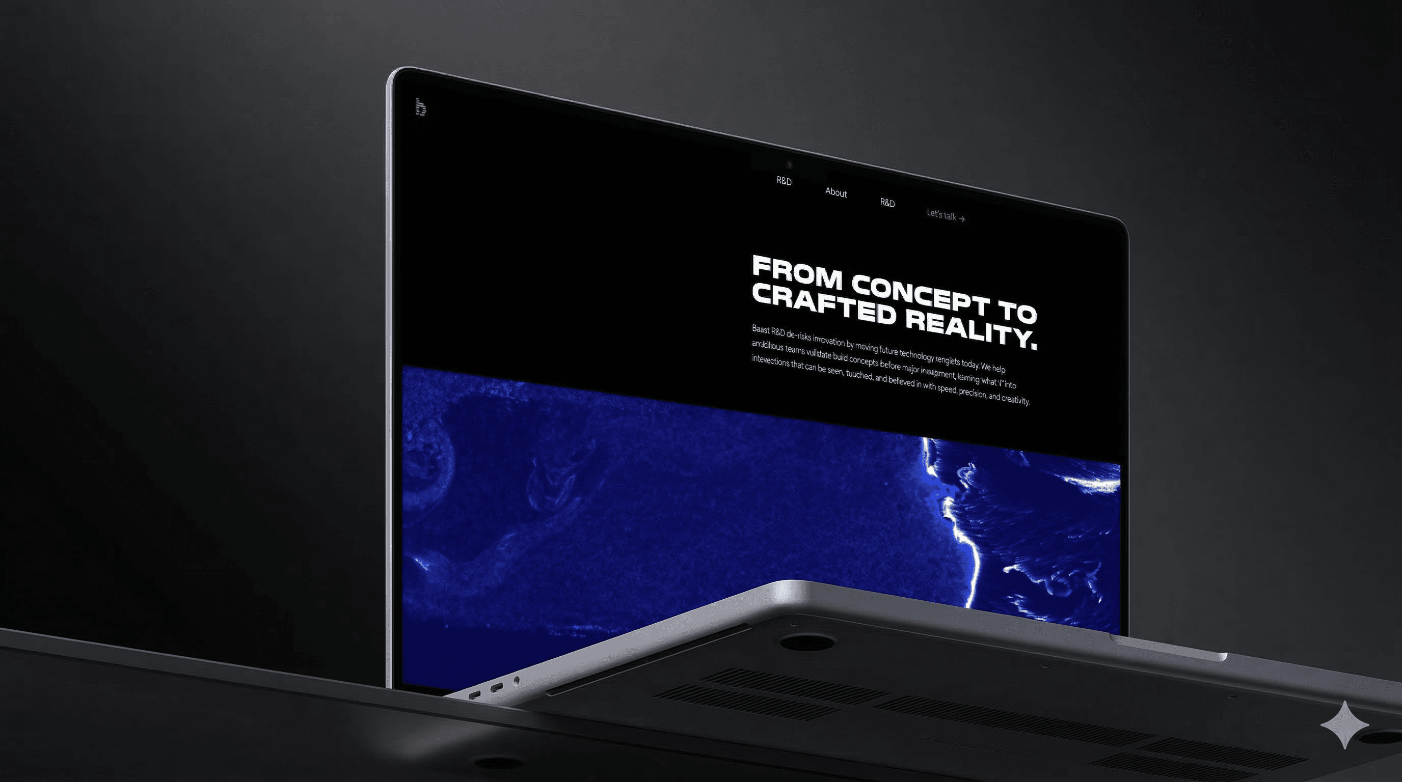
I built Baast’s first campaign story for the R&D offer. It gave the team a clearer way to explain the service, its value, and why it matters in the market.
Modular Visual Asset
I also built a modular visual system with rules for type, image, and layout. This made it easier to use the campaign across the website, social, and decks while keeping the brand consistent.

Problem Context
Baast did not yet have one clear story for this offer. That made it harder to explain its value, show its relevance in the market, and attract the right partners.
The social channels were also not supporting business development well. Reach was low, and the content was not giving the right audience a strong reason to engage.
At the same time, the brief used “innovation” as a key value, but it was still too broad. It needed a clearer meaning before it could become a strong campaign message.


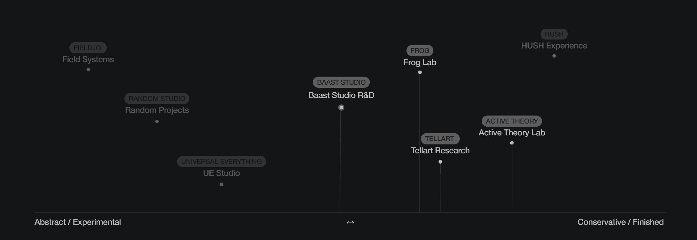
I reviewed six creative tech competitors to understand how the market was already presenting similar offers. I looked at their visuals, messaging, and overall brand feel. A clear pattern came up: many were using bold, high-energy campaign work to grab attention. That left room for a different approach. Instead of trying to be louder, Baast could stand out through a more controlled and story-led direction.

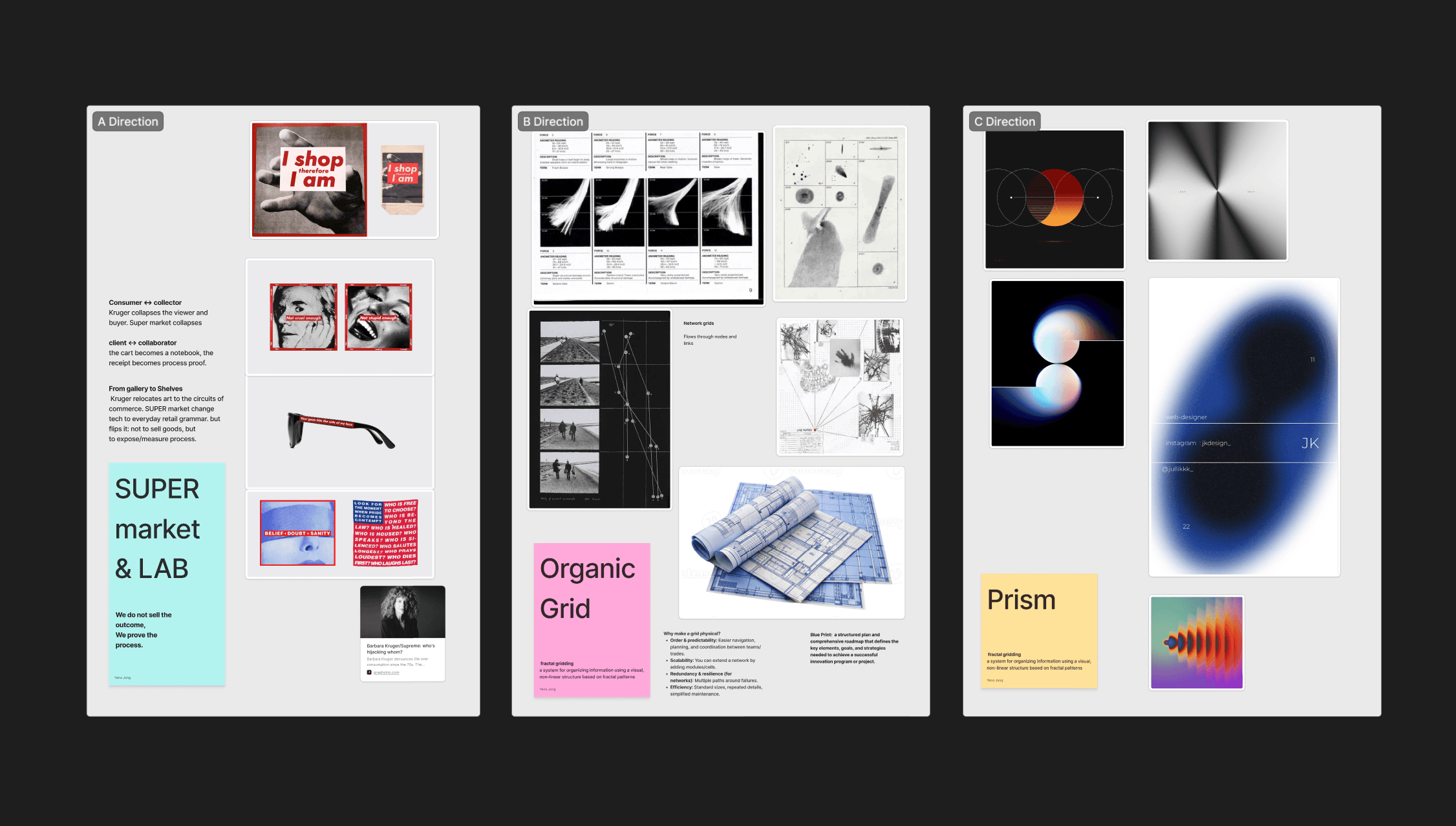
With the market gap clear, I explored three concept directions: Supermarket Lab, Organic Grid, and Prism. Each one tested a different way to express the offer. Prism stood out as the strongest direction. It gave the team the clearest story and the strongest structure to build on. The other concepts still mattered. They helped test the criteria and sharpen the decision. But Prism was the one that made the next step clear.
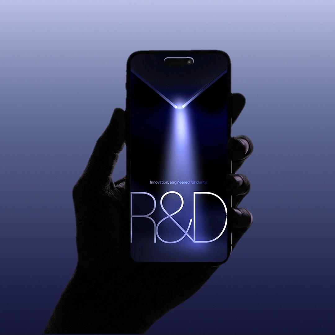
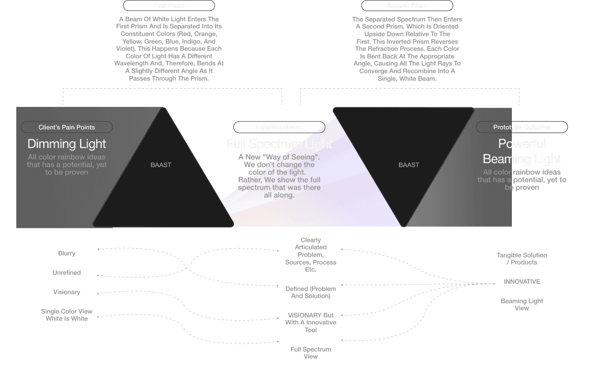
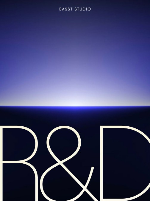
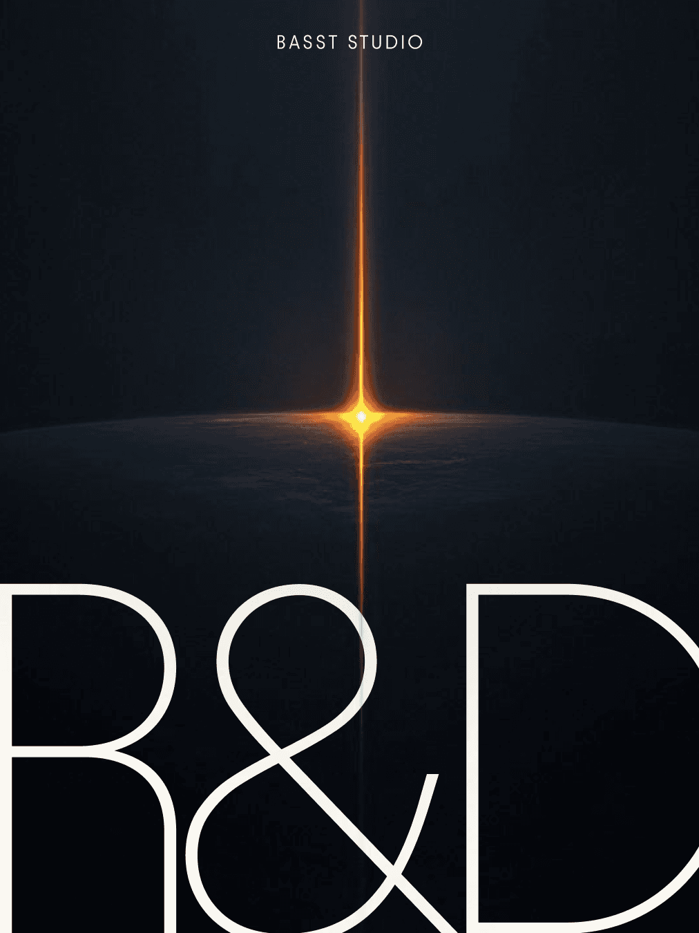
TWO PRISMS, INNOVATOR
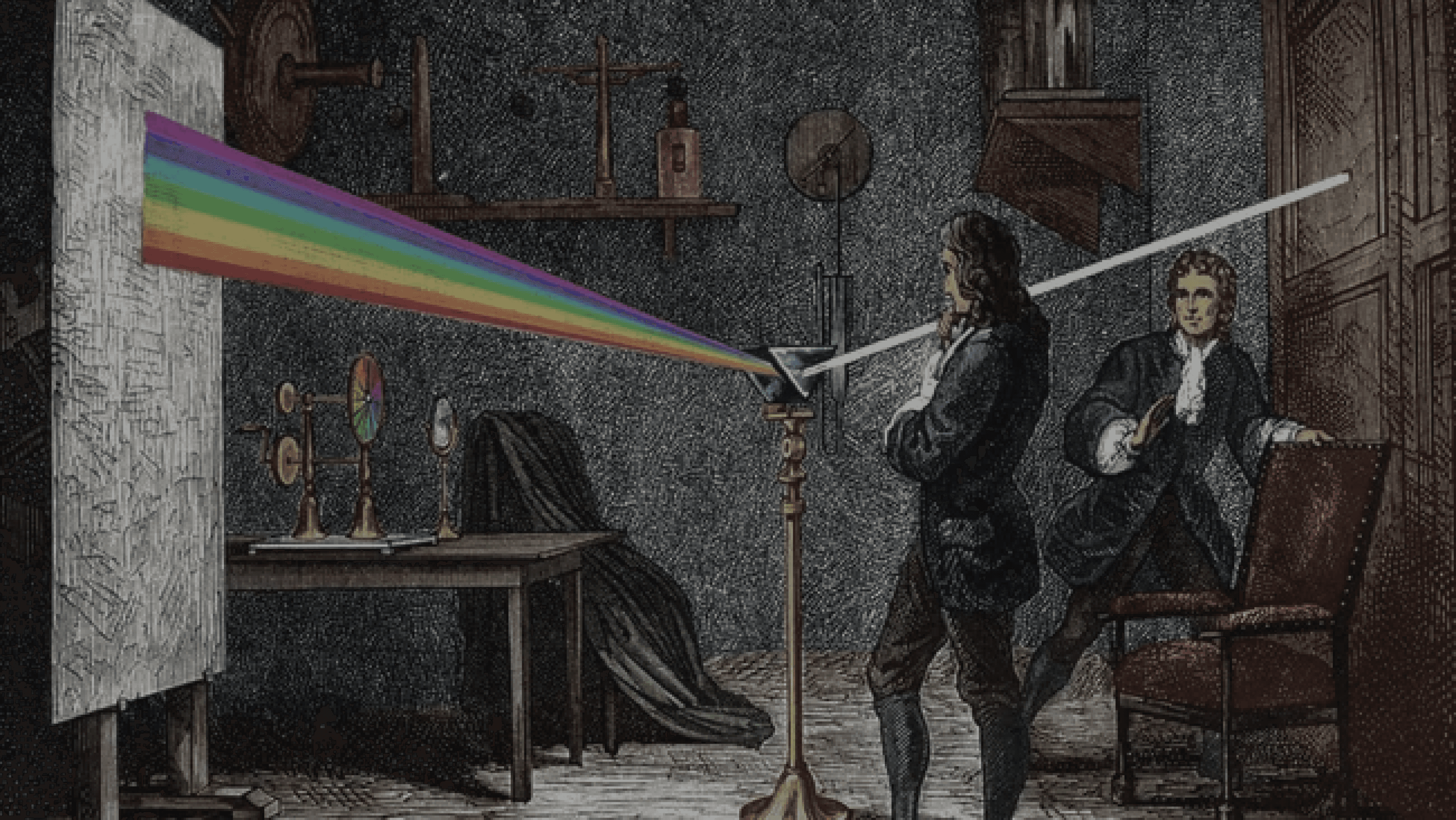
The Prism idea became stronger once I linked it to a simple thought: Baast does not force a new color onto an idea. It helps reveal the full range that is already inside it.
That became the key phrase behind the concept. Like a prism splitting light into a spectrum, Baast takes something that may still look unclear at first and makes its real potential visible.
This mattered because it gave the campaign a clearer way to talk about innovation. Not as decoration or noise, but as a way of seeing more clearly, finding what matters, and turning it into a focused outcome.
With the market gap clear, I explored three concept directions: Supermarket Lab, Organic Grid, and Prism. Each one tested a different way to express the offer. Prism stood out as the strongest direction. It gave the team the clearest story and the strongest structure to build on. The other concepts still mattered. They helped test the criteria and sharpen the decision. But Prism was the one that made the next step clear.

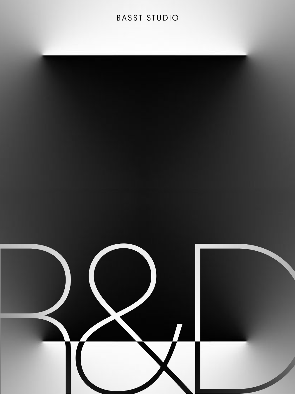
I built a storytelling map to help the team work from one clear idea before production started. It gave us a shared structure for how the concept should move across the campaign. The story had two parts. First, the prism opens one beam into a full spectrum, showing the possibilities inside a problem. Then it brings that spectrum back into one clear beam, turning exploration into a focused result.This made Baast’s process easier to explain: open things up, then shape them into one clear direction.
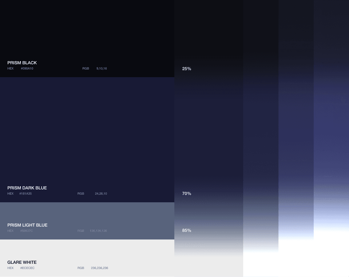
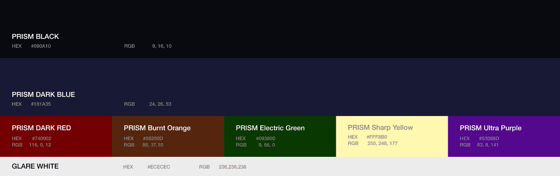
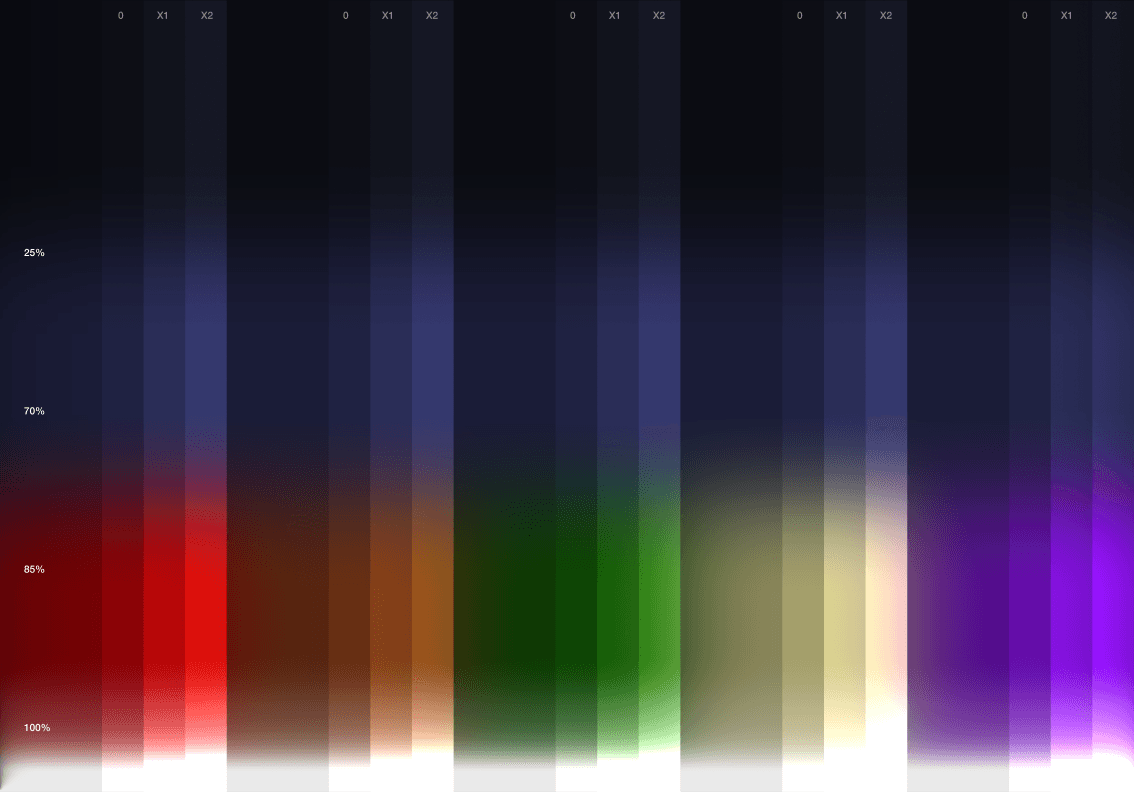
Baast is built on contrast: a deep, trustworthy blue for precision and reliability, and a bright white for clarity and real-world results. Thin beams of red, yellow, green, purple, and orange add the energies of innovation: vision, logic, scalability, imagination, and creativity. Like a prism, BAAST takes complexity and turns it into something visible, aligned, and actionable. It doesn’t just make things look clear, it helps innovation become clear.
PRIMARY COLOR
Glare White
character
usage
Trust Navy
character
usage
SECONDARY SPECTRUM COLOR
Color
Frequency
Symbolism
Messaging Role
🔴 Dark Red
🟡 Sharp Yellow
🟢 Electric Green
🟣 Ultra Purple
🟠 Burnt Orange


PRIMARY COLOR
SECONDARY COLOR
Internal Reflection translates complexity into structure through a refracted grid, supporting precision scan and measuring cues with depth and system logic, while Glare acts as a controlled highlight that marks clarity, used for proof moments, clarity spikes, and punctuation cues to direct attention and signal a premium sense of resolution.
Internal Reflection
Glare

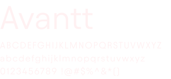
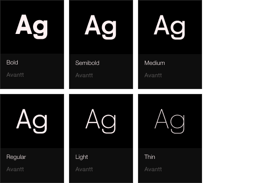
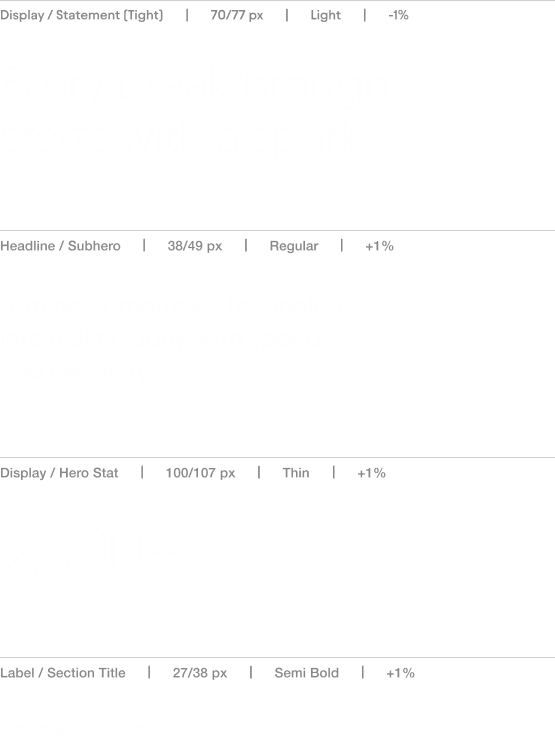
Baast’s previous typographic assets leaned heavily on bold weights, which made the brand feel louder than premium. For this direction, I shifted the typographic voice toward restraint and precision. I chose Avantt as the primary typeface even though it’s often used as a secondary or body font. That decision was intentional: its cleaner, more neutral tone supports a premium feel when the typesetting is disciplined. Instead of relying on weight for impact, I focused on typeset control in hierarchy and spacing for less manual mico-typesetting .
Avantt

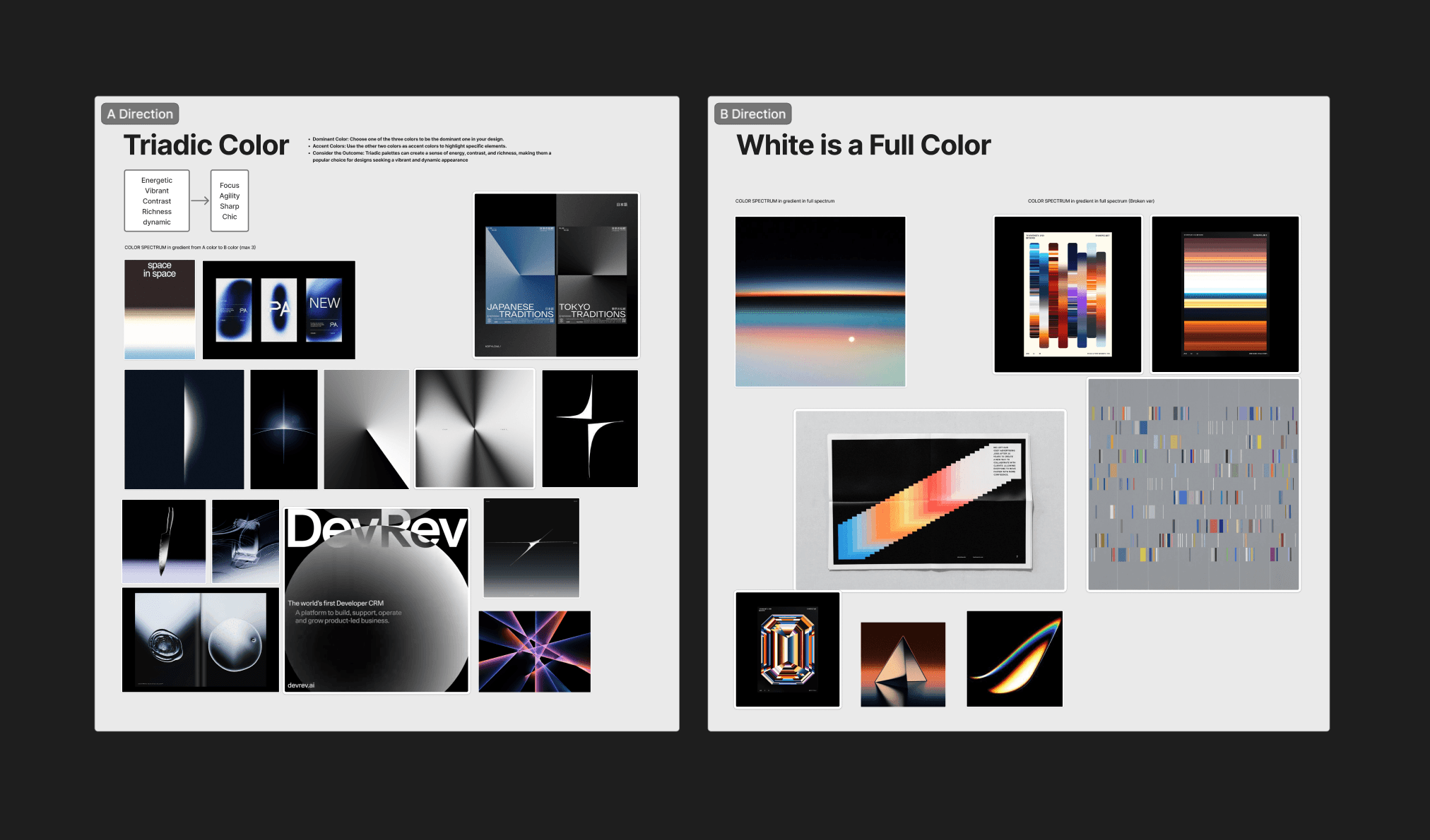
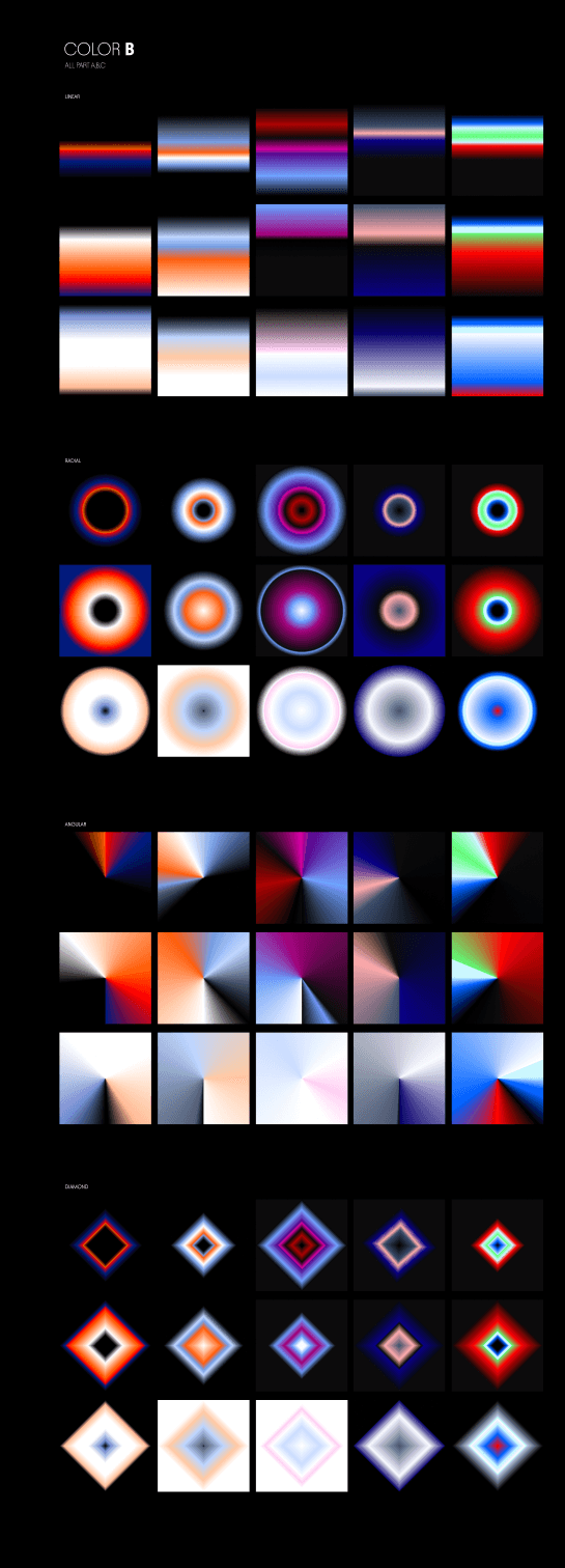
AI was used as a fast visual exploration tool. I generated background directions in Midjourney to test premium gradient atmospheres and light motifs (horizon glow, point light, controlled contrast, color spectrums etc.). I then curated the strongest outputs and finished them in Photoshop for retouch.

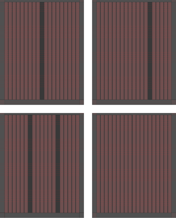
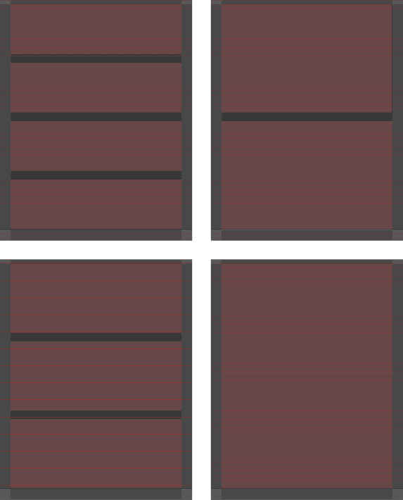
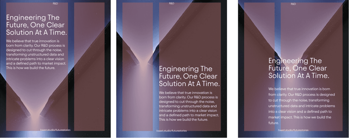
I built a grid system for 1080×1350 so Instagram posts can scale without losing a premium tone. Premium, for me, is spacing discipline: generous margins, clear hierarchy, and enough air for the content to feel intentional rather than crowded. The vertical grid matters because it locks alignment and proportion across every post, so type and imagery always sit on the same invisible structure. That consistency is what makes a feed feel curated, even when topics change. The horizontal grid then controls reading rhythm by standardising where headings, supporting lines, and details land, so each post feels edited and calm. Together, the system supports announcements, proof posts, and carousels without redesigning from scratch each time.
This layout do and don’t guideline provides a practical framework for assembling campaign assets. I focused on legibility, grid alignment, and visual hierarchy to ensure a sophisticated look and a clear message across every compartments as listed below:
Image/video/graphic (no text)
Cta / link + image/video
Paragraph + image/video
Header + image/video + data points
Header + graphics + data points
Header + image/video
Header + subheader + image/video
Paragraph
Header + subheader
Header + paragraph

Do
Do Use a consistent split logic: left text / right image, or centered text on top of image, or full-bleed image with centered text Pick one per carousel section so the system feels intentional.
Do Place text in quiet areas of the image (negative space like sky, plain walls, blurred zones).
Do One dominant headline. One short supporting paragraph. Keep supporting text short enough to read in one breath. Keep the footer line (URL / tag) small and consistent, aligned to the same baseline.
Don’t
Don’t place text over busy texture / high-detail zones (hands, edges, highlights, product details). Don’t let text sit on top of hard image transitions (horizons, sharp diagonals, strong highlights) unless the layout intentionally anchors there.
Don’t mix alignments inside one layout (headline centered but paragraph left, etc.) unless you have a clear grid reason. Don’t “almost center” the split. If there is a vertical axis, it must be exact.
Don’t compress line spacing or shrink paragraph text to fit. If it doesn’t fit, reduce copy or change layout. Don’t let the paragraph run too long. If it becomes dense, move detail to the next slide.
Reflection
Prism pushed me to understand art direction less as styling and more as selection. I kept noticing that a campaign can lose strength very quickly when too many references, messages, or visual gestures compete at once. In this project, the challenge was not to make it louder. It was to make it more deliberate. I learned that premium presence rarely comes from adding more visual effects. It comes from knowing what to keep, what to repeat, and what to leave out.